Jonathan Torres December 3, 2013
As instructed, students were to embark on a process similar to that of a museum curator. More specifically, respective students were to assemble ten individual pieces which correlate through a specific lens or perspective. This was done to further comprehend what it is like to be someone tasked with designating artworks for an esteemed institution; (these artworks can be found at the Metropolitan Museum website). As a curator, I wanted to visualize the setting before selecting the respective pieces. It did not take long to fathom, but I had internalized a room which was as close to the comfort of what heaven (supposedly) should feel like. After establishing the theme of the setting I searched for pieces of art which could have had religious symbolism, fantasy, luxury, and anything which is deemed universally desirable. In conjunction with this premise, I chose two small sculptures of angels (by two respective artists), one made of copper and the other being a Christmas ornament, as well as a larger sculpture of a bright bronze colored angel. The angels are direct symbolism of creatures who are pure in nature and guardians. Along with the angels, I selected two respective pieces of art which contain imagery of lions. An aquamanile (tool used to pour water) in the shape of a lion along with a candlestick which is erected off the back of a lion sculpture occupy the room. Lions have often been associated with bravery and nobility, appropriate traits for a divine room. Luxurious furniture is present as "Princely Furniture" made by the esteemed Roentgen family sits in the theoretical space. On top of the Roentgen cabinets is another piece; a small but infinitely elegant bottle made by the Chinese in the 18th century. It adorns a depiction of a European woman and child on the spherical forefront of the bottle and the image is framed by soothing, organic swirls of blue, pink, green, and maroon with a gold cap and gold base at each respective end. Placed on a mantelpiece (as to establish prominence) is the "Head of Bhairava" a copper sculpture which seems like a mask. It is a bright copper sculpture with elegant details such as the headdress or facial features (which appear to flare due to the patterns and texture). Along the same mantel, an oil pastel painting entitled "Pleasure" shall rest. The painting itself is of a naked female wearing a floral crown and holding flowers whose essence coincides with the room. Symbolizing visceral fantasy, the image is isolated by a large golden frame-piece. Last but not least is a two foot tall, copper sculpture of a Buddhist guru named "Padmasambhava" sitting cross legged atop a rectangular shaped fixture. The subject matter of the room makes Padmasambhava a perfect fit as he is depicted as a composed, mystic being (although the ideals of Buddhism may not correlate with the content of the room). Ultimately, these items are decorations for a room as opposed to the actual makeup of a room. When digesting the pieces presented, one can envision their own ideal room with the ingredients I have put forth.
Tuesday, December 3, 2013
Curator Image Directory *Decor of the Divine*
 |
| "Angel" (Sanmartino) |
 |
| "Angel" (Ludovico) |
 |
| "Victory" |
 |
| "Head of Bhairava, The Wrathful Form of Shiva" |
 |
| "Snuff Bottle w European Woman and Child" |
 |
| "The Spiritual Master Padmasambhava" |
 |
| "Princely Furniture" (Roentgens) |
 |
| "Lion Pricket Candlestick" |
 |
| "Lion Aquamanile" |
 |
| "Pleasure"
Sources
Del Duca,
Ludovico. Angel.
1590-1600. Copper alloy, with brown patina... Italian Renaissance & Baroque
Bronze Sculpture from the Robert Lehman Collection / Metropolitan Museum, New
York, New York.
Gaudens,
Augustus Saint. Victory.
1892-1903. Bronze, gilt. The New American Wing / Metropolitan Museum, New York,
New York.
Head of
Bhairava, the Wrathful Form of Shiva. Sixteenth Century. Gilt copper with Rock Crystal and Paint.
Masterpieces of Tibetan and Nepalese Art: Recent Acquisitions, New York, New York.
Lion
Aquamanile. 1220-30. Copper alloy. Medieval Treasures from Hildesheim
/Metropolitan Museum, New York, New York.
Lion
Pricket Candlestick.
1250-75. Copper alloy. Medieval Treasures from Hildesheim/ Metropolitan Museum,
New York, New York.
Mengs, Anton
R. Pleasure. 1754. Pastel
on paper, laid down on canvas. Eighteenth Century Pastels/ Metropolitan Museum,
New York, New York.
Roentgen,
Abraham, and David Roentgen. The
Princely Furniture of the Roentgens. 1742- Early 1800's. Photography (of
Furniture). Extravagant Inventions / Metropolitan Museum, New York, New York.
Sanmartino,
Giuseppe. Angel.
Eighteenth Century (2nd Half). Polychromed terracotta head, wooden limbs and
wings, wire... Christmas Tree and Neapolitan Baroque Creche /Metropolitan Museum,
New York, New York.
Snuff
Bottle with European Woman and Child. Eighteenth Century. Painted enamel on copper. Small
Delights: Chinese Snuff Bottles / Metropolitan Museum, New York, New York.
The Spiritual
Master Padmasambhava.
Fourteenth Century. Copper alloy. Materpieces of Tibetan and Nepalese Art:
Recent Acquisitions / Metropolitan Museum, New York, New York.
|
Tuesday, November 19, 2013
"Performance Art at the Whitney Museum"
Last week our class went on a filed trip to the renowned Whitney Museum. Specifically, we went to browse the "Rituals of Rented Island" exhibit which was a collection of ephemeral artworks. Ephemera is the term used to describe various forms of documentation which record the respective performance arts. Ephemera is vital to the concept of performance art as a whole as it emphasizes the fact that a performance is a designated event which occurs in a very isolated moment in time. To better put this in perspective, try to imagine how much time has ever passed since the very first second ever. Now, imagine how puny the moment in time during a performance is within this context. Ephemera are indeed the remnants of the isolated occurrence but are not the only ones as the artist and audience both shared that moment in time. Of course that is if there is an audience and if so, the connection is intimate in nature as the sheer fact that the performance will never be duplicated adds mysticism to the atmosphere. At the Whitney, I encountered remnants of a Vito Acconci work entitled "Claim/Excerpt". The ephemera in this instance was a video recording of Acconci seated in a chair while in a dark room which was a basement. Acconci swung a metal pipe or bar around aimlessly as he spoke maniacally to himself. There was an interesting addition to the performance as there were videos being relayed to the street level above the basement and there were speakers which made the erratic rants audible to anyone who would wander by. There was also an option to go down the stairs and attempt to view the crazed man but that most likely did not happen (as was most probably intended). Another exhibit I remembered was the Michael Smith exhibit. I was able to view video recordings of the "Secret Horror" performance. This performance was unlike the others as it seemed to induce humor and was even goofy. The portion of the performance I was able to see included Michael Smith in a bedroom being harassed by ghosts (which I believe were people in white sheets with eyeholes). The subject matter seemed to parody horror in general as Michael Smith seemed to get more and more anxious at the random activities of the ghosts, which included branding each others back with a hot iron. The ghosts also appear randomly by (uncharacteristically) entering the frame by simply coming through a door or under a piece of furniture. The tension builds until they all (including Smith) breakout into a show tune, singing "Owimoweh" over and over (The Tokens- "The Lion Sleeps Tonight"). Overall I enjoyed the learning experience and found a new respect for performance based arts as the temporal aspect was emphasized through all the ephemera.
http://www.mikes-world.org/videos/secrethorrorvideo.html
Tuesday, November 5, 2013

Untitled Exhibit:
The first exhibit I entered was the "Untitled" exhibit. The class had to walk through Chinatown in order to reach the section of the Lower East Side where the exhibits were. The environment outside the exhibits was vastly different than the luxurious setting in Chelsea. The Lower East Side galleries are subtly placed between the streets of Chinatown which gives off an urban essence. The streets are filled with shady vendors selling cheap knockoffs, parody t-shirts, or drug paraphernalia on the sidewalk. Chinatown seems to be home to a lower socio-economic class whereas Chelsea has a thriving I honestly felt very comfortable as the rugged texture of the city felt familiar to various other neighborhoods I have been in throughout NYC. Not that I embrace shady people and cheap shops, but they are in no way taboo to a weathered New Yorker. The exhibit itself was a room in which you would have to walk through the reception desk. At the very forefront of the gallery is a large suspended frame with a mixture of vivid colors. This exhibit seemed to me to be very anticlimactic after they opted to go with the "untitled" gimmick. Nothing stood out to me however I do not undermine the talent I was in front of.
Eileen Quinlan Exhibit:
This exhibit also failed to keep me enthralled however I did find several topics of interest within the exhibit. The techniques utilized were quite unique as I had never before been exposed to such. Quinlan utilizes the process of "decay" (as mentioned in the press release) in order to manipulate her photographic art. A work of interest includes some shots with dimmed lighting wh ere the image undergoes a metamorphosis after a set period of time due to the "decay" (attributable to respective variables of the medium and artist's intent).
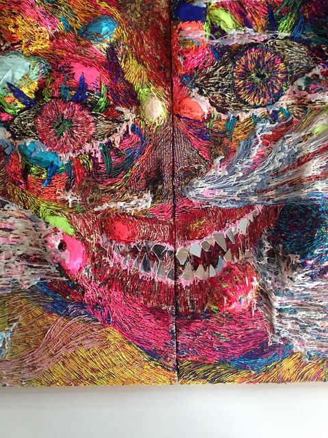
HYON - GYON - PHANTOMS ON PARADE
This exhibit is one where I actually wish I had several thousand dollars to spare in order to invest. I would be flabbergasted if this artist's style were to go unnoticed by the mainstream. The compositions were similar in their makeup and subject matter, however these respective pieces of work each are something to marvel at. Cloth is used ingeniously as the material which creates the "flesh" of these demons; the cloths are set as large layers and at times are spread out as thin as possible, the image resembling burnt flesh with several holes. The cloths can be heavily textured or smooth to represent the varying layers of "flesh". Silicon (melted?) is dripped on various spots of the demon's mouth, giving off a menacing and repulsive image. The teeth are individual pieces of glass or plastic which you can see your own reflection in.
The first exhibit I entered was the "Untitled" exhibit. The class had to walk through Chinatown in order to reach the section of the Lower East Side where the exhibits were. The environment outside the exhibits was vastly different than the luxurious setting in Chelsea. The Lower East Side galleries are subtly placed between the streets of Chinatown which gives off an urban essence. The streets are filled with shady vendors selling cheap knockoffs, parody t-shirts, or drug paraphernalia on the sidewalk. Chinatown seems to be home to a lower socio-economic class whereas Chelsea has a thriving I honestly felt very comfortable as the rugged texture of the city felt familiar to various other neighborhoods I have been in throughout NYC. Not that I embrace shady people and cheap shops, but they are in no way taboo to a weathered New Yorker. The exhibit itself was a room in which you would have to walk through the reception desk. At the very forefront of the gallery is a large suspended frame with a mixture of vivid colors. This exhibit seemed to me to be very anticlimactic after they opted to go with the "untitled" gimmick. Nothing stood out to me however I do not undermine the talent I was in front of.
Eileen Quinlan Exhibit:
This exhibit also failed to keep me enthralled however I did find several topics of interest within the exhibit. The techniques utilized were quite unique as I had never before been exposed to such. Quinlan utilizes the process of "decay" (as mentioned in the press release) in order to manipulate her photographic art. A work of interest includes some shots with dimmed lighting wh ere the image undergoes a metamorphosis after a set period of time due to the "decay" (attributable to respective variables of the medium and artist's intent).
HYON - GYON - PHANTOMS ON PARADE
This exhibit is one where I actually wish I had several thousand dollars to spare in order to invest. I would be flabbergasted if this artist's style were to go unnoticed by the mainstream. The compositions were similar in their makeup and subject matter, however these respective pieces of work each are something to marvel at. Cloth is used ingeniously as the material which creates the "flesh" of these demons; the cloths are set as large layers and at times are spread out as thin as possible, the image resembling burnt flesh with several holes. The cloths can be heavily textured or smooth to represent the varying layers of "flesh". Silicon (melted?) is dripped on various spots of the demon's mouth, giving off a menacing and repulsive image. The teeth are individual pieces of glass or plastic which you can see your own reflection in.
Tuesday, October 22, 2013
MoMA : Applied Design - Functionality
HIGH FUNCTIONALITY:
"Basic House" (Prototype)
Artist: Martín Ruiz de Azúa
Polyester , 200 x 200 x 200 cm (1999)
Martin de Azua's "Basic House" is an artwork which has high value in respects to functionality. This artwork was a prototypical design for a portable home which was mainly meant to house the less fortunate in society. The purpose of this work is quite noble and charitable but that is not what constitutes it as a high functioning artwork. It is extremely light and transportable as it can be folded up like a "handkerchief" and is energy efficient as it is powered through the hot air emanating from grilles in urban streets.
"Mine Kafon wind powered demenir"
Artist: Massoud Hassani
Bamboo and bio-degradable plastics, 221 x 221 x 221 cm (2011)
Hassani's "Mine Kafon" is a marvelous work of art as it is quite aesthetically potent as well as technically proficient. The artwork resembles a sphere with toilet plungers emanating from the center with the rubber heads pointing outwards. The perfect symmetry (dimensions) of the design allow for this invention to be rolled on vast plains like a giant ball or boulder. The purpose of this artwork was to suppress the explosive damage of a land mine. This artwork is high in functionality as it serves its intended purpose, by absorbing the blasts from land mines and neutralizing their crippling power.
LOW FUNCTIONALITY:
"Blur Building" (Switzerland)
Artist : Diller & Scofidio
This artwork is an architectural design of a building which is placed in a location where the atmosphere and environment play a key role in the aesthetics of the artwork. The Museum only has a photo image of the building but the caption states that 35,000 different hoses shoot out water at high speeds in order to spray the area with mist. The final product depicts a building immersed in clouds (fog). The piece is low in functionality as it serves no formal purpose other than to be appreciated aesthetically. The use of 35,000 hoses could render this as high in functionality to some but my criteria relies on the use of the artwork outside of the purpose of being appreciated as art.
"Oxygen House Project"
Artist: Douglas Darden
Pencil, crayon, ink, chalk, and paper (1988)
Douglas Darden's "Oxygen House Project" is quite the unique artwork. The concept itself is different, but the presentation of the artwork with a fictitious backstory is also appealing, stylistically. The drawing is of a tent filled with oxygen designed for a fictitious character, in need of oxygen after a train derail. The object is low in functionality as it serves a rhetorical being. It cannot be used by any human being but most definitely can stimulate minds and enthrall imagination. Had this artwork been used for a specific individual or used for a performance art, perhaps it would have merited a higher rank of functionality
**REFERENCES** http://www.moma.org/collection/browse_results.php?SHR&tag=AppliedDesign
Tuesday, October 8, 2013
Field Trip #2 (Chelsea Galleries)
DAVID ZWIRNER EXHIBIT
"Hustlers" by Philip - Lorca Dicorcia
I personally enjoyed this artwork as i did not understand the premise until after I left the exhibit. This artwork is a series of photographs taken in 1990-1992 in the Hollywood area of California. The subjects of the photos are male prostitutes who are captured posing. The appeal of the photo is that the subjects are captured in the same way they view themselves. According to the press release, the author payed the subjects the same amount that they would have charged a customer. The intent was to highlight the way the subjects carry themselves, as products to be enjoyed. The art is further emphasized by its location as Hollywood has always been a place where people seek fantasy. The photos themselves were greatly done as the lighting and quality of the shots make them seem as if they were screen shots from an 80's pop culture film.
"Best Seen, Not Heard" by Philip - Lorca Dicorcia
This artwork takes the series of photos from "Hustlers" and presents them in a new light. The photos are mixed and edited with old pornographic video intros and outros. The inspiration behind this clip was Edward Hopper's style as the author states that this artwork was meant to imply what the men do as opposed to directly revealing their occupations. The artwork was displayed next to several of Hopper's paintings in France.
"To Wit" by Raymond Pettibon
I enjoyed most illustrations and texts presented in this exhibit as they all tied in with one another (although not apparent o myself at the time). Several artworks included pop culture icons and others were very graphic (phallic). I personally liked the phrases written across the walls of the white room which immediately capture one's attention as you come in. The phallic artworks were a little off putting because usually i associate art which has large quantities of penises as something merely intended for "shock value" but as I try (and fail) to find meaning in that particular subject matter I realize that to dismiss it is extremely close minded. Perhaps the male pieces were littered around the room to confuse or make the audience uncomfortable with such graphic imagery. Eventually the "shock" of the images set a higher standard of tolerance in me for art..
Wednesday, October 2, 2013
Field Trip Reaction #1
Jonathan
Torres
Introduction
to Art
October
1st, 2013
Field
Trip Reaction
Art
& Identity – The Museum of Modern Art
During
a class trip to the Museum of Modern of Art, my peers and I were
asked to record three artworks of our choosing in order to analyze
the author's identity in accordance with his or her artwork. Three
classifications of “Identities” were introduced to the class for
analysis, them being, Personal Identity, Cultural Identity, and
Historical Identity. The three artworks I was fascinated by were
Evening Star #3 by Georgia O'Keeffe, Woman by Ivan Le Lorraine, and
PACMAN by Toru Iwatani.
Georgia
O'Keeffe's Abstraction Blue,
an oil based painting on canvas done in 1926, is a mystifying piece
of work as the color scheme is clearly meticulously composed. The
range of colors is very limited but effectively used as different
shades and tints of blue are arranged into a shape which emulates a
flame. Through the middle of the “flame” is a vertical white line
which divides the image into two, unequal parts. There is a subtlety
to the image as the colors are layered over one another, yet there
are certain key points in the outline of the shape where the colors
seem to blend seamlessly. When viewing this artwork I could not help
but think of the Cultural Identity prompt. I thought of how
O'Keeffe's stylistic influences were evidently communicated through
this particular image. The title itself holds the word “abstract”
which this image certainly is. O'Keeffe was an artist during the
modern era, a cultural movement amongst artist's where the limits of
painting, amongst other mediums, were exploited. This image leaves an
impression of vagueness, where the artist chose to depict the essence
of the subject matter as opposed to an accurate portrayal. These
choices could possibly be attributable to the cultural influences of
Georgia O'Keeffe.
The
artowork entitled Woman
by Ivan Le Lorraine, an oil based painting on canvas done in 1928,
captured my attention immediatley. An aged human in petty lighting
adorning an open, oversized fur coat enthralled me as it was so
different from the other artworks. Le Lorraine used to draw for the
U.S. Army during World War 2 and experienced firsthand many of the
tragedies that come as a result of war. Through the Personal Identity
prompt, this image becomes easier to comprehend. Le Lorraine wanted
to emulate the imminent stage of life we know as being elderly. The
image highlights the wrinkled flesh of the elderly woman as Le
Lorraine's intent is successful in depicting the “decay” of the
human body.
The
final artwork under analysis is Toru Iwatani's Pacman, a video game
published by Namco in 1981. This artwork is to be seen through the
Historical Identity lens. Iwatani created the game during a time when
video games were only beginning to take on prominent appeal in the
world. Iwatani created the game with the intent to appeal to a
universal audience, an ideal reflective of the progressive mentality
of the 20th
century. The characters and layout of the game was meant to appeal to
younger audiences as well as females; Iwatani had a stroke of genius
as video games (still to this day) tend to appeal to isolated
demographics. The medium itself is reflective of the time period.
In conclusion, my trip to the MoMA
has influenced me as both an artist and a critic. Now when I review
any form of art I understand that it is imperative to inquire as to
the reasons why an art work was made. This process of trying to
excavate information is effective as viewers (or players) will have a
guided thinking process upon interacting with the art. This is not
necessarily desirable but it is something which can better aid a
viewer into fathoming what an artist was thinking, his or her intent,
and much more.
Sunday, September 29, 2013
Narrative DIgital Collage
 |
| This digital collage came out a lot more eery than I had intended for but thats not necessarily a bad thing. My digital collage is a satirical take on the world of polotics. In short, the message being converyed is that people are quick to admire and glorify the political figures we see in the media, without any personal inquiry into the backgrounds of said individuals. I am not to imply anything, verbally, but the images are quite suggestive, intentionally. |
Tuesday, September 17, 2013
Good Art vs Bad Art
Jonathan Torres
*GOOD ART*
I find good art to be mentally stimulating, although one can argue that an artwork which is intentionally underwhelming (and successful) to also be good, due to the intent of the author. Good art should breed subjective thoughts as anything which maintains objectivity is nothing more than the presentation of fact whereas Good Art is literally anything which makes a human being think for themselves, ultimately resulting in a specific perception. Good Art is pure perception as physical objects just exist and the human mind is the phenomenon which transforms anything, wether it be a physical object or hypothetical concept, into an actual entity within a biased context. Good Art is anything manufactured by a person who is either inspired by an emotion or who has the intent to instill emotion.

*BAD ART*
I don't know if I believe in Bad Art. The only concept I feel labeling as Bad Art would be blank space. Considering that my definition of Good Art is anything which spawns thought, I don't feel as if anything merits that title. I think of art with egregious violence, obscenity, minimalist art, etc, but they all generate emotion or thoughts. Bad Art would be something which has absolutely no effect on us, even on a subconscious level. Everything is art. Aside from the concept itself, a rendering of said concept (even images/memories in our mind) can be construed as Good Art.
Subscribe to:
Posts (Atom)